Anthem Tattoo Co
A complete redesign & modernization of Anthem Tattoo’s website

About
Work
Contact
Timeframe
3 months / 80 hours
My Role
Ux/Ui Designer & Researcher
Tools
Figma, Adobe Illustrator, Optical Workshop
View Prototype


Overview
Anthem Tattoo is a popular tattoo studio based in Edmonton, Alberta, Canada. With a already impressive and growing number of followers the studio has a ton of potential. With all that being said however, it’s online presence leaves something to be desired.
The Problem
The existing online solution feels dated, incomplete and failes to capture the essence of the studio
In the dynamic world of body art, first impressions matter. For our client, a relatively new tattoo shop, the need for a website redesign became more and more evident after testing the current site with several users. Users expressed that their user experience was hindered, potentially turning away potential clients.
Problem
Solution
My Approach
Research
Design
Wireframes
Prototype
Reflections


“
Too much text...i would never read that.
“
this site feels unfinished
“
This link is broken
“
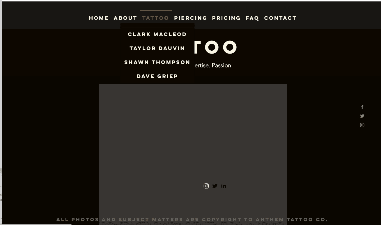
Why are the Artist’s under the tattoo ?
“
how do i book a consult?
Old Design
My goals for this project was to help improve Anthem’s online website experience, extend their brand market reach and expand its business goals. With the addition of a merch section I have completely revamped and modernized the site from its current solution.
How might we help Anthem Tattoo overcome its users lacklustre enthusiasm for its current website solution? This case study delves into the challenges faced, the objectives set, and the journey undertaken to revitalize the digital face of our client's business.
The Approach
Empathy

Understand the users needs & constraints
Research

Researh goals
Researh Plan
Market Research
Competitive Analysis
Define

Personas
User Journey
User Flow & Task Flows
Sitemap
Design

Sketches
Wireframe
UI & Style
HI Fidelity Prototype
Testing

Usability Testing
Affinity Mapping
Iterate

Revisions
Empathy
By understanding that a website serves as a virtual storefront for any tattoo shop, and after carefully analysis of Anthem Tattoo’s seemingly incomplete and user-unfriendly website, one imagines the frustration users must encounter. Therefore it is a must to use an empathetic approach in creating a seamless digital space between the artistry of the tattoo shop and a effortless user-friendly interface.
Research
A two-fold approach was employed here for my user research.
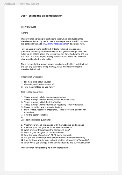
First, was a round of usability testing of the current solution.
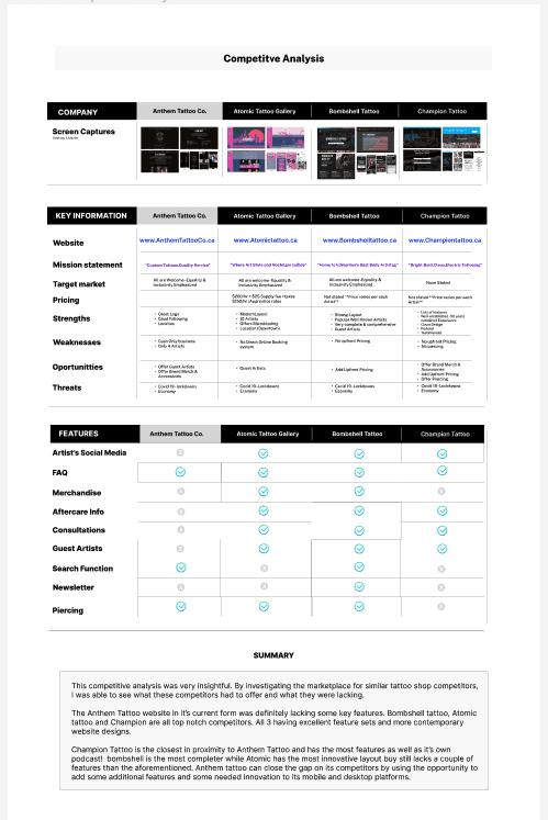
Second was the market research specifically, a competitive analysis was created to see what the competition was doing right & wrong
Research Tools Methods
Research Plan/Goals
The research plan was crafted with the end user in mind.
Usability Test - current site
5 interviewees
Uses who have tattoos or might be planning on getting one soon
Conducted over zoom calls over 1 wk
Questions were:
Results: How many people liked dislike would visit would not?
Next actions taken


“The site has way too much text”
“I dont think i would not get a tattoo from here”
Overall impression of the site was not favourable
75 % of users said the site was not welcoming
Disjointed & poorly organized were used to describe the site
Users were underwhelmed by the site
Users rated the likely hood they would use this site between 2-5/10
100% of users liked the logo
All users felt the addition of branded Merch would be a good addition
Key Insights
Overall, the user testing was a success based onteh feedback i receieved the over arching setiment was the site altho it beeing suffice was missing several things and was nit user friendly. There were repeated paint point with naviagation missing info and to much text ws often mentioned. This had not provoded enough to validate a new redesign.
Summary
Competitive analysis
4 competitors
What did u think of
How likely are u to
What did you think of

Researched 4 local competitors
BLANK BLANK ABLAKNK
NOTICED COMMONE
ANTHEM COULD USE SIMILAR
Summary
Overall, the user testing was a success based onteh feedback i receieved the over arching setiment was the site altho it beeing suffice was missing several things and was nit user friendly. There were repeated paint point with naviagation missing info and to much text ws often mentioned. This had not provoded enough to validate a new redesign.
Define
02
01
Personas
Goals
> Have trust in the artist she chooses
> To feel confident that the shop is clean and safe.
> Realize her vision for all of her tattoo ideas
>To find an artist she can use again and again
Stacey is a stylist who admires people with cool ink. With a few tattoos of her own, she’s planning for her next one. Researching and following her favourite artists online she needs to see a lot of images and testimonials before choosing her next artist or shop. Stacey is ok waiting long periods for the right artist and wants to be able to book and consult with them first online.
.
About
Frustrations
> Not being able to book an appointment on the site directly
> Lack info information on aftercare
> Stress about whether she will be happy with the outcome
>Regrets over her last tattoo
Devices
Stacey uses her laptop and phone equally. Her Macbook for work and for research and her phone while out and about or socializing
Social Media
Stacey Martinez
“I always do a lot of research beforehand and Instagram is the place I go for inspiration”
Age: 31
Family: Single
Job: Stylist
Location: West Coast
Mackbook - 50%
Iphone - 50%

“The planner”
Goals
> To commemorate the birth of her first child
> To find an artist who specializes in realism
> Wants to work with a highly skilled artist
>Find a tattoo shop closer to her home
>to set up a consultation from home
Jennifer has recently just had her first child. She wants her very first tattoo to be of her newborn’s picture, or there name. Not having a lot of spare time or experience she wants to be able to find a local tattoo shop and artist where she can communicate and book with them easily.
.
About
Frustrations
> Lack of time to spend endless hours to research
>Anxious about getting her first tattoo
>Cannot afford expensive tattoo
>Very best artist are hard to book
Devices
Jennifer uses a laptop phone and smart watch. The laptop primarily these days for work, she wears her watch all the time even monitors her sleep with it
Social Media
Jennifer Taylor
“I need a highly skilled artist, If It’s going to be on my body forever, it has to be perfect ”
Age: 26
Family: Married
Job: Marketing
Location: Seattle
Mackbook - 50%
Smartwatch -90%
Iphone - 25%
“The firrst-timer”

I developed these personas based off the preceding research findings validating the design choices prior to implementation. I referenced these throughout the design process and helped based off real user needs goals
Information Architecture
User flows

3 user flows were created to gain clarity on how users would complete certain tasks
This was valuable by revealing interactions and entry/exit points users will face

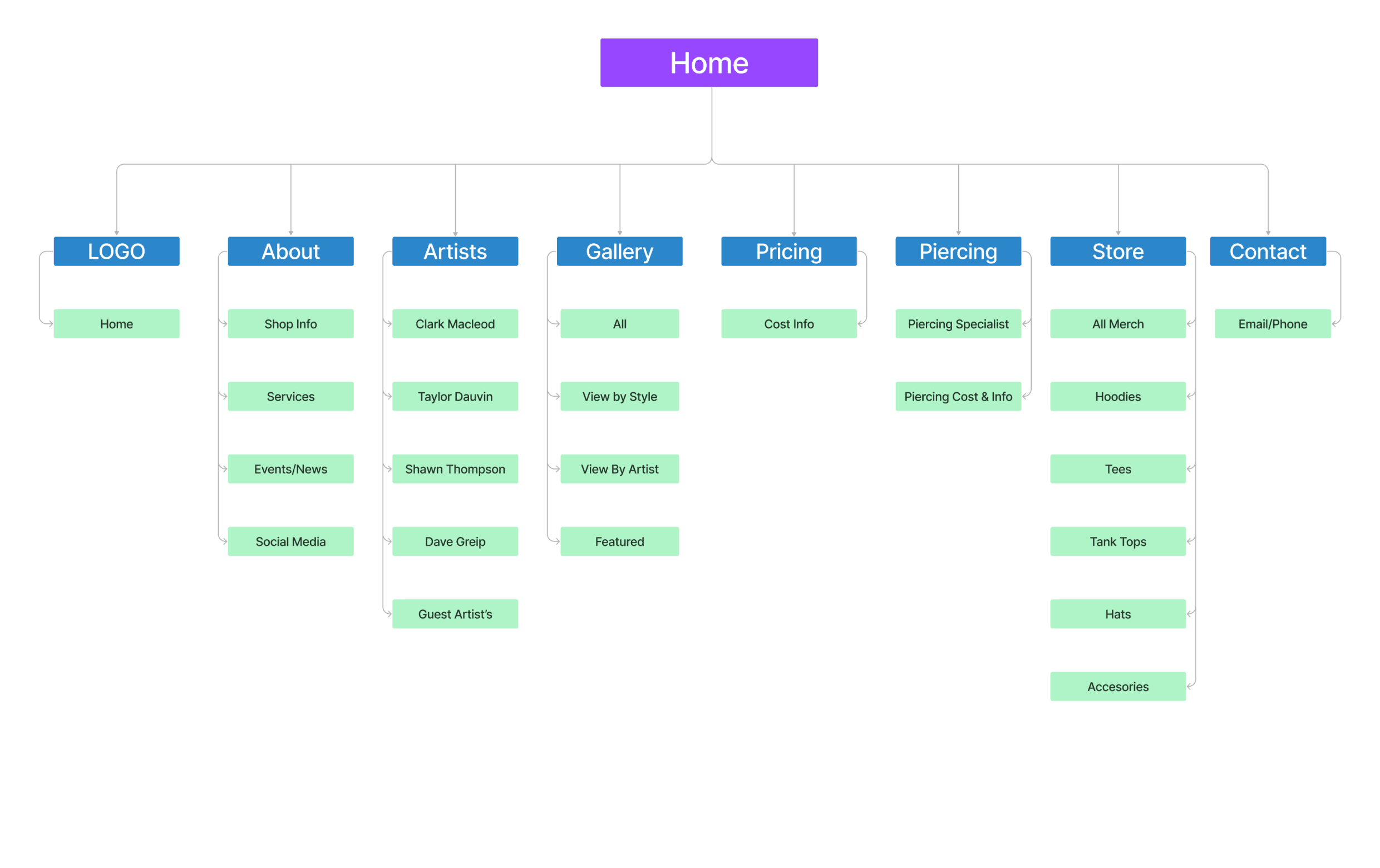
Sitemap
New nav bar design was requested by users
Adding the Merch/Store meant i needed to implement this into the new sitemap
The sitemap now accurately reflects the final layout of the new site
Re-did the sitemap to reflect the new features and new design
Design
Sketches /
Lo-fi Wireframes
The use of sketches to begin my design process was key in finding the best direction for the new layout and new features.
I began by sketching the key screens first revamping artist page home page for both mobile & desktop